html - CSS3图片滑动效果
问题描述
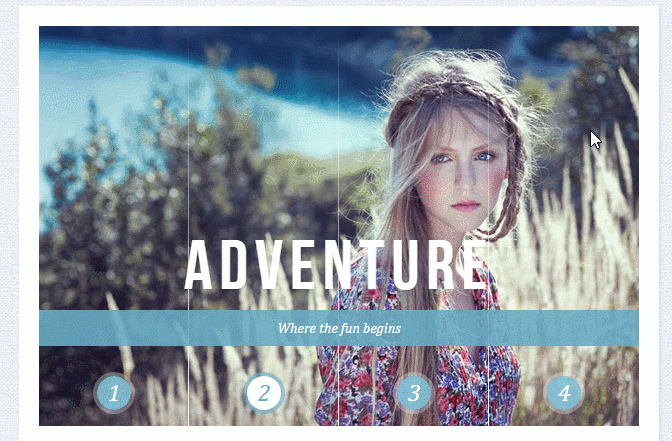
需实现的效果如下
<!DOCTYPE html><html lang='en'> <head><meta charset='UTF-8' /><meta http-equiv='X-UA-Compatible' content='IE=edge,chrome=1'> <title>Sliding Image Panels with CSS3</title><meta name='viewport' content='width=device-width, initial-scale=1.0'> <meta name='description' content='Sliding Image Panels with CSS3' /><meta name='keywords' content='sliding, background-image, css3, panel, images, slider' /><meta name='author' content='Codrops' /><link rel='shortcut icon' href='https://www.haobala.com/favicon.ico'> <link rel='stylesheet' type='text/css' href='https://www.haobala.com/wenda/css/demo.css' /><link rel='stylesheet' type='text/css' href='https://www.haobala.com/wenda/css/style1.css' /> </head> <body><p class='container'> <header><h1>Sliding Image Panels <span>with CSS3</span></h1><p class='codrops-demos'> <a href='https://www.haobala.com/wenda/index.html'>Demo 1</a> <a href='https://www.haobala.com/wenda/index2.html'>Demo 2</a> <a href='https://www.haobala.com/wenda/index3.html'>Demo 3</a> <a href='https://www.haobala.com/wenda/index4.html'>Demo 4</a></p> </header> <section class='cr-container'><input name='radio-set-1' type='radio' checked/><label for='select-img-1' class='cr-label-img-1'>1</label><input name='radio-set-1' type='radio' /><label for='select-img-2' class='cr-label-img-2'>2</label><input name='radio-set-1' type='radio' /><label for='select-img-3' class='cr-label-img-3'>3</label><input name='radio-set-1' type='radio' /><label for='select-img-4' class='cr-label-img-4'>4</label><p class='clr'></p> <p class='cr-bgimg'> <p><span></span><span></span><span></span><span></span> </p> <p><span></span><span></span><span></span><span></span> </p> <p><span></span><span></span><span></span><span></span> </p> <p><span></span><span></span><span></span><span></span> </p></p><p class='cr-titles'> <h3><span>Serendipity</span><span>What you’ve been dreaming of</span></h3> <h3><span>Adventure</span><span>Where the fun begins</span></h3> <h3><span>Nature</span><span>Unforgettable eperiences</span></h3> <h3><span>Serenity</span><span>When silence touches nature</span></h3></p> </section></p> </body></html>
下面这个是style1.css
.cr-container{ width: 600px; height: 400px; position: relative; margin: 0 auto; border: 20px solid #fff; box-shadow: 1px 1px 3px rgba(0,0,0,0.1);}.cr-container label{ font-style: italic; width: 150px; height: 30px; cursor: pointer; color: #fff; line-height: 32px; font-size: 24px; float:left; position: relative; margin-top:350px; z-index: 1000;}.cr-container label:before{ content:’’; width: 34px; height: 34px; background: rgba(130,195,217,0.9); position: absolute; left: 50%; margin-left: -17px; border-radius: 50%; box-shadow: 0px 0px 0px 4px rgba(255,255,255,0.3); z-index:-1;}.cr-container label:after{ width: 1px; height: 400px; content: ’’; background: -moz-linear-gradient(top, rgba(255,255,255,0) 0%, rgba(255,255,255,1) 100%); background: -webkit-gradient(linear, left top, left bottom, color-stop(0%,rgba(255,255,255,0)), color-stop(100%,rgba(255,255,255,1))); background: -webkit-linear-gradient(top, rgba(255,255,255,0) 0%,rgba(255,255,255,1) 100%); background: -o-linear-gradient(top, rgba(255,255,255,0) 0%,rgba(255,255,255,1) 100%); background: -ms-linear-gradient(top, rgba(255,255,255,0) 0%,rgba(255,255,255,1) 100%); background: linear-gradient(top, rgba(255,255,255,0) 0%,rgba(255,255,255,1) 100%); filter: progid:DXImageTransform.Microsoft.gradient( startColorstr=’#00ffffff’, endColorstr=’#ffffff’,GradientType=0 ); position: absolute; bottom: -20px; right: 0px;}.cr-container label.cr-label-img-4:after{ width: 0px;}.cr-container input.cr-selector-img-1:checked ~ label.cr-label-img-1,.cr-container input.cr-selector-img-2:checked ~ label.cr-label-img-2,.cr-container input.cr-selector-img-3:checked ~ label.cr-label-img-3,.cr-container input.cr-selector-img-4:checked ~ label.cr-label-img-4{ color: #68abc2;}.cr-container input.cr-selector-img-1:checked ~ label.cr-label-img-1:before,.cr-container input.cr-selector-img-2:checked ~ label.cr-label-img-2:before,.cr-container input.cr-selector-img-3:checked ~ label.cr-label-img-3:before,.cr-container input.cr-selector-img-4:checked ~ label.cr-label-img-4:before{ background: #fff; box-shadow: 0px 0px 0px 4px rgba(104,171,194,0.6);}.cr-container input{ display: none;}.cr-bgimg{ width: 600px; height: 400px; position: absolute; left: 0px; top: 0px; z-index: 1;}.cr-bgimg{ background-repeat: no-repeat; background-position: 0 0;}.cr-bgimg p{ width: 150px; height: 400px; position: relative; float: left; overflow: hidden; background-repeat: no-repeat;}.cr-bgimg p span{ position: absolute; width: 150px; height: 400px; top: 0px; left: -150px; z-index: 2;}.cr-container input.cr-selector-img-1:checked ~ .cr-bgimg,.cr-bgimg p span:nth-child(1){ background-image: url(../images/1.jpg);}.cr-container input.cr-selector-img-2:checked ~ .cr-bgimg,.cr-bgimg p span:nth-child(2){ background-image: url(../images/2.jpg);}.cr-container input.cr-selector-img-3:checked ~ .cr-bgimg,.cr-bgimg p span:nth-child(3){ background-image: url(../images/3.jpg);}.cr-container input.cr-selector-img-4:checked ~ .cr-bgimg,.cr-bgimg p span:nth-child(4){ background-image: url(../images/4.jpg);}.cr-bgimg p:nth-child(1) span{ background-position: 0px 0px;}.cr-bgimg p:nth-child(2) span{ background-position: -150px 0px;}.cr-bgimg p:nth-child(3) span{ background-position: -300px 0px;}.cr-bgimg p:nth-child(4) span{ background-position: -450px 0px;}.cr-container input:checked ~ .cr-bgimg p span{ -webkit-animation: slideOut 0.6s ease-in-out; -moz-animation: slideOut 0.6s ease-in-out; -o-animation: slideOut 0.6s ease-in-out; -ms-animation: slideOut 0.6s ease-in-out; animation: slideOut 0.6s ease-in-out;}@-webkit-keyframes slideOut{ 0%{ left: 0px; } 100%{ left: 150px; }}@-moz-keyframes slideOut{ 0%{ left: 0px; } 100%{ left: 150px; }}@-o-keyframes slideOut{ 0%{ left: 0px; } 100%{ left: 150px; }}@-ms-keyframes slideOut{ 0%{ left: 0px; } 100%{ left: 150px; }}@keyframes slideOut{ 0%{ left: 0px; } 100%{ left: 150px; }}.cr-container input.cr-selector-img-1:checked ~ .cr-bgimg p span:nth-child(1),.cr-container input.cr-selector-img-2:checked ~ .cr-bgimg p span:nth-child(2),.cr-container input.cr-selector-img-3:checked ~ .cr-bgimg p span:nth-child(3),.cr-container input.cr-selector-img-4:checked ~ .cr-bgimg p span:nth-child(4){ -webkit-transition: left 0.5s ease-in-out; -moz-transition: left 0.5s ease-in-out; -o-transition: left 0.5s ease-in-out; -ms-transition: left 0.5s ease-in-out; transition: left 0.5s ease-in-out; -webkit-animation: none; -moz-animation: none; -o-animation: none; -ms-animation: none; animation: none; left: 0px; z-index: 10;}.cr-titles h3{ position: absolute; width: 100%; text-align: center; top: 50%; z-index: 10000; opacity: 0; color: #fff; text-shadow: 1px 1px 1px rgba(0,0,0,0.1); -webkit-transition: opacity 0.8s ease-in-out; -moz-transition: opacity 0.8s ease-in-out; -o-transition: opacity 0.8s ease-in-out; -ms-transition: opacity 0.8s ease-in-out; transition: opacity 0.8s ease-in-out;}.cr-titles h3 span:nth-child(1){ font-family: ’BebasNeueRegular’, ’Arial Narrow’, Arial, sans-serif; font-size: 70px; display: block; letter-spacing: 7px;}.cr-titles h3 span:nth-child(2){ letter-spacing: 0px; display: block; background: rgba(104,171,194,0.9); font-size: 14px; padding: 10px; font-style: italic; font-family: Cambria, Palatino, 'Palatino Linotype', 'Palatino LT STD', Georgia, serif;}.cr-container input.cr-selector-img-1:checked ~ .cr-titles h3:nth-child(1),.cr-container input.cr-selector-img-2:checked ~ .cr-titles h3:nth-child(2),.cr-container input.cr-selector-img-3:checked ~ .cr-titles h3:nth-child(3),.cr-container input.cr-selector-img-4:checked ~ .cr-titles h3:nth-child(4){ opacity: 1;}/* Media Query: Let’s show the inputs on mobile sized browsers because they probably don’t support the label trick: */@media screen and (max-width: 768px) { .cr-container input{display: inline;width: 24%;margin-top: 350px;z-index: 1000;position: relative; } .cr-container label{display: none; }}
如果按照上面的代码,个人感觉CSS处理逻辑略微复杂、html结构也不够清晰,不知道有没有更好的的方法实现同样的效果。
问题解答
回答1:- -这就是4块【无缝滚动】拼起来的。。需要注意的是获取图片数量时,只获取每个区域下的,不要搞混淆。
写了个简单的例子,拿去参考下:
https://jsfiddle.net/hqojLLL4/1/
回答2:把它当成4个单图的幻灯片来做,做出一个就能出4个
回答3:可以用background-position来分割图片
相关文章:
1. javascript - nginx 反向代理 js跨域问题?2. css3 - img垂直水平居中问题3. javascript - sublime已经安装了babel插件和sublimelinter-jshint为什么还是显示es6语法错误?4. html5 - 为什么浏览器可以显示HTML文档中未被定义的标签?5. javascript - 图片能在网站显示,但控制台仍旧报错403 (Forbidden)6. 主从复制 - MySQL 主从延迟 300s 以上,求大神解答7. 请教使用PDO连接MSSQL数据库插入是乱码问题?8. javascript - 百度地图一开始设置了中心点,怎么通过按钮在调转到对应的中心点????9. mysql - 在PHPMyadmin上乱捣鼓后出现 了 - #2002 - — 服务器没有响应(或本地服务器的套接字没有正确设置)。10. 关于设计mysql中一个字段自增的函数。

 网公网安备
网公网安备