这种凹角用css3如何实现
问题描述
问题解答
回答1:<!DOCTYPE html><html lang='en'><head> <meta charset='UTF-8'> <title>Title</title> <style>.outer{ position: absolute; left: 100px; top: 100px; width: 300px; height: 500px; background-color: #0a6ebd; display: flex; justify-content: center; align-items: center; box-sizing: border-box; border: 1px solid #0a6ebd;}.inner-1{ width: 250px; height: 450px; box-sizing: border-box; background-color: #0da6ec; position: relative; display: flex; justify-content: center; align-items: center; border: 1px solid red; border-top-left-radius: 25px;}.inner-2{ width: 200px; height: 400px; box-sizing: border-box; background-color: #00bcd4; position: relative; border: 1px solid red; border-top-left-radius: 25px;}.left-corner{ width: 25px; height: 25px; /* border-radius: 100%; */ border-bottom-right-radius: 100%; background-color: inherit; position: absolute; left: -1px; top: -1px; z-index: 10; border-bottom: 1px solid red; border-right: 1px solid red; box-sizing: border-box;} </style></head><body> <p class='outer'><p class='inner-1'> <p style=' background-color: #0a6ebd;'></p> <p class='inner-2'><p style='background-color: #0da6ec;'></p> </p></p> </p></body></html>回答2:
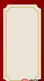
<!DOCTYPE html PUBLIC '-//W3C//DTD XHTML 1.0 Transitional//EN' 'http://www.w3.org/TR/xhtml1/DTD/xhtml1-transitional.dtd'><html xmlns='http://www.w3.org/1999/xhtml' xml:lang='en'><head> <meta http-equiv='Content-Type' content='text/html;charset=UTF-8'> <title>css</title></head><body><style>#a { width: 150px; height: 300px; background: radial-gradient(circle at top left, transparent 15px, #e6e4b7 0) top left, radial-gradient(circle at top right, transparent 15px, #e6e4b7 0) top right, radial-gradient(circle at bottom right, transparent 15px, #e6e4b7 0) bottom right, radial-gradient(circle at bottom left, transparent 15px, #e6e4b7 0) bottom left; background-size: 50% 50%; background-repeat: no-repeat; padding: 20px 24px 22px 20px;}#b { display: block; background: radial-gradient(circle at top left, transparent 15px, red 0) top left, radial-gradient(circle at top right, transparent 15px, red 0) top right, radial-gradient(circle at bottom right, transparent 15px, red 0) bottom right, radial-gradient(circle at bottom left, transparent 15px, red 0) bottom left; background-size: 50% 50%; background-repeat: no-repeat; width:100%; height: 100%; padding: 2px;}#b:before { content: ''; width: 100%; height: 100%; display: block; background: radial-gradient(circle at top left, transparent 15px, #e6e4b7 0) top left, radial-gradient(circle at top right, transparent 15px, #e6e4b7 0) top right, radial-gradient(circle at bottom right, transparent 15px, #e6e4b7 0) bottom right, radial-gradient(circle at bottom left, transparent 15px, #e6e4b7 0) bottom left; background-size: 50% 50%; background-repeat: no-repeat;}</style> <p id='a'><p id='b'></p> </p></body></html>回答3:
假设这个p id是a
#a { width: 100px; height: 300px; background: radial-gradient(circle at top left, transparent 8px, #e6e4b7 0) top left, radial-gradient(circle at top right, transparent 8px, #e6e4b7 0) top right, radial-gradient(circle at bottom right, transparent 8px, #e6e4b7 0) bottom right, radial-gradient(circle at bottom left, transparent 8px, #e6e4b7 0) bottom left; background-size: 50% 50%; background-repeat: no-repeat;}
具体参数自己调一下
回答4:border-radius?
回答5:这个是横着的,但也比较接近了:http://jsfiddle.net/x4wLf/
相关文章:
1. html5 - 图片一般一怎么的形式存放在服务器中的?2. node.js - mongodb查找子对象的名称为某个值的对象的方法3. python - flask post提交timestamp不能作为参数,这是为什么?4. 网页爬虫 - python 爬取网站 并解析非json内容5. vue.js - vue-router开启HTML5的history模式后nginx配置6. 百度地图api - Android 百度地图 集成了定位,导航 相互的jar包有冲突?7. 使用list和each配合,的作业,输出一行后,如何换行8. 继承Controller类之后报错9. java - 如何点击按钮,重新运行(我是初学者)?10. javascript - 如何获取未来元素的父元素在页面中所有相同元素中是第几个?

 网公网安备
网公网安备