vue实现多个echarts根据屏幕大小变化而变化实例
前言
有如下页面需求:在一个页面展示多个echarts图表,并且根据屏幕大小变化而变化。
实例
可以封装成组件使用,以增加代码复用性
// myCharts.vue <template> <div ref='charts'></div></template><script>import echarts from ’echarts’export default { name: ’myCharts’, props: { type: { type: String, default: ’’ } }, data () { return { resizeTimer: null, myChart: null } }, methods : { init () { let myChart = echarts.init(this.$refs.charts); this.myChart = myChart; myChart.setOption({ xAxis: { type: ’category’, boundaryGap: false, data: [’Mon’, ’Tue’, ’Wed’, ’Thu’, ’Fri’, ’Sat’, ’Sun’] }, yAxis: { type: ’value’ }, series: [{ data: [820, 932, 901, 934, 1290, 1330, 1320], type: ’line’, areaStyle: {} }] }); } } mounted () { this.init(); // 初始化图表 let _this = this; window.addEventListener(’resize’, function () { if (_this.resizeTimer) clearTimeout(_this.resizeTimer); _this.resizeTimer = setTimeout(function () { _this.myChart.resize(); }, 100) }) }}</script><style lang='less' scoped> .charts-comps{ width: 100%; height: 100%; }</style>
这样就可以在需要用到的地方使用了
// index.vue<template> <my-charts ref='charts' v-for='item in dataList' :key='item'></my-charts></template><script>import myCharts from ’./myCharts’export default { name: ’test’, components: {myCharts}, data () { return { dataList: [’test1’,’test2’,’test3’,’test4’] } } } </script>
关键代码解析
let _this = this;window.addEventListener(’resize’, function () { ...})
在myCharts组件中去监听窗口大小变化,这样可以针对每一个图表很方便的resize()重绘图表(Echarts.resize()是echarts的对图表进行重新绘制的方法)。这里使用window.addEventListener而不使用window.onresize的原因是:window.onresize绘覆盖掉前面定义的方法,而只执行最后一个,导致图表只有最后一个重绘了,而window.addEventListener避免了这个问题。
if (_this.resizeTimer) clearTimeout(_this.resizeTimer);_this.resizeTimer = setTimeout(function () { _this.myChart.resize();}, 100)
结合 函数防抖(debounce) 避免在窗口大小变化时频繁的进行图表的resize()。在处理复杂的function时可以很大限度的提高性能。实现原理就是对要执行的目标方法延时处理,设置一个定时器,当再次执行相同方法时(窗口大小变化时会被频繁的侦听到onresize),若前一个定时任务还未执行完,则清除掉定时任务,重新定时。这样当屏幕大小在100毫秒之内没有再次变化时才会对Echarts进行resize(),当然时间段可以根据自身需要设置长一点。
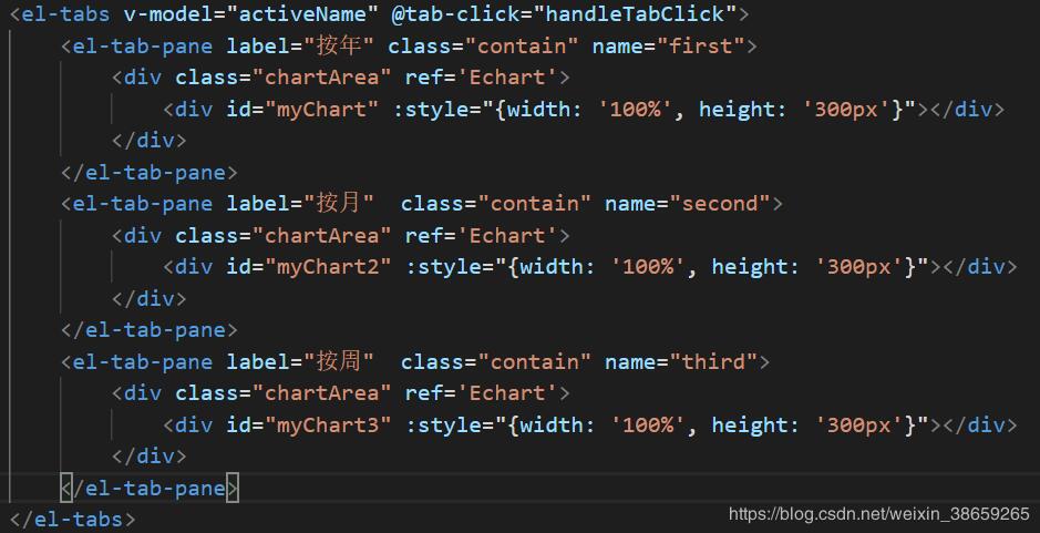
补充知识:vue+echarts 同页面多个echarts图表,明明宽度设置的都是100%,却只有第一个生效以及如何实现自适应
问题描述
三个echarts图表,明明宽度设置的都是100%,却只有第一个生效以及如何实现自适应
解决办法
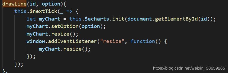
1.初始化时需要加上,确保操作的是最新的DOM
this.$nextTick(_ => { });
2.echarts图表自适应实现,需要在渲染图表后加上
window.addEventListener('resize', function() { myChart.resize(); });
完整如下:
以上这篇vue实现多个echarts根据屏幕大小变化而变化实例就是小编分享给大家的全部内容了,希望能给大家一个参考,也希望大家多多支持好吧啦网。
相关文章:
1. macos - mac下docker如何设置代理2. docker-machine添加一个已有的docker主机问题3. docker镜像push报错4. docker images显示的镜像过多,狗眼被亮瞎了,怎么办?5. mysql - phpmyadmin怎么分段导出数据啊?6. dockerfile - 为什么docker容器启动不了?7. docker内创建jenkins访问另一个容器下的服务器问题8. debian - docker依赖的aufs-tools源码哪里可以找到啊?9. 关于docker下的nginx压力测试10. docker start -a dockername 老是卡住,什么情况?
 网公网安备
网公网安备