这种情景怎么解释?display:flex 遭遇 white-space: nowrap;
问题描述
html如下,使用了flex-box布局,左边图片的img-box定宽,右边的css定义了flex-item,然后对shop-name进行了单行不换行截断,这时候就发现左边的图片被挤扁了,小于定的宽度。发生这个情况在chrome上,ios和安卓的微信下正常.
chrome效果见图:
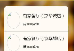
<a href="#" class="coupons-item flex"> <div class="img-box"><img src="1.jpg" /></div> <div class="flex-item"><h3 class="shop-name">有家餐厅(京华城店)</h3><div class="text">满100减20</div> </div></a>
(scss)
.coupons-item{ padding:1rem; color:#000; text-decoration: none; border-bottom:1px solid $gray-border-color; .img-box{ width:6rem; height:6rem; margin-right:1rem; @include radius(50%); overflow: hidden; img{ display: block; width:100%; height:100%; @include radius(50%); } } .shop-name{ line-height:2; height:3.6rem; font-weight:normal; font-size:1.8rem; overflow: hidden; -ms-text-overflow: ellipsis; text-overflow: ellipsis; white-space: nowrap; } .text{ font-size:1.4rem; }}
问题解答
回答1:之前遇到过,解决办法:首先.flex-item设置下最小宽度
min-width:0
然后.shopname设置下宽度
width:100%
相关文章:
1. angular.js - angular内容过长展开收起效果2. dockerfile - 为什么docker容器启动不了?3. 为什么我ping不通我的docker容器呢???4. debian - docker依赖的aufs-tools源码哪里可以找到啊?5. docker - 如何修改运行中容器的配置6. android - Apk 中找不到r类文件7. angular.js使用$resource服务把数据存入mongodb的问题。8. java - logback可以生成文件,但是日志无法输出到文件内?9. java - 哪位大神做过考勤打卡定位功能?请大神指点10. javascript - es6模块加载export的输出值有点没太搞明白
 网公网安备
网公网安备