python画环形图的方法
本文实例为大家分享了python画环形图的具体代码,供大家参考,具体内容如下
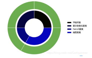
import os import pandas as pdimport matplotlib.pyplot as pltimport randomimport numpy as np # 获取渐变色的listdef gradual(number): colors = [] h = 0.00001 gradual2 = random.uniform(0, 1) r = gradual2 if gradual2 >= 0.5: g = h b = gradual2 else: g = gradual2 b = h colors.append((r, g, b, 1)) for i in range(number - 1): # 大于0.5 则为绿色渐变,小于则为蓝色渐变 if gradual2 >= 0.5: g = 1 if ((1 - h) / number) > 1 else (g + (1 - h) / number) else: b = 1 if ((1 - h) / number) > 1 else (b + (1 - h) / number) colors.append((r, g, b, 1)) return colors # 获取绿色的个数,standardRedIndex为要将那个颜色改为红色def listGreen(number, standardRedIndex): colors = [] for i in range(number): if i == standardRedIndex - 1: colors.append(’r’) else: colors.append(’#6CAD4F’) return colors # 画环形图def circularGraph(outerData, innerData, labels, standardRedIndex): data = pd.DataFrame([outerData, innerData], columns=labels) # 设置字体这样才可以显示中文 plt.rcParams[’font.sans-serif’] = ’Microsoft YaHei’ plt.rcParams[’axes.unicode_minus’] = False plt.figure(figsize=(8, 5)) colors = gradual(len(labels)) # 数据内环 plt.pie(data.iloc[1, :], radius=0.65, wedgeprops=dict(width=0.3, edgecolor=’w’), colors=colors) # 数据外环 plt.pie(data.iloc[0, :], radius=1, wedgeprops=dict(width=0.3, edgecolor=’w’), colors=listGreen(len(labels), standardRedIndex)) # 获取ax label ax = plt.subplot(1, 1, 1) # loc是位置,bbox_to_anchor是位置坐标,borderaxespad将图例放外面 frameon=False去掉图例边框 # bbox_to_anchor 的y坐标 y = -1 / 40 * len(labels) + 0.5 ax.legend(labels, loc=4, bbox_to_anchor=(1.3, y), borderaxespad=0., frameon=False) plt.show() circularGraph([30, 30, 20, 40, 20, 20, 40, 20, 20, 40, 20], [30, 30, 20, 40, 20, 20, 40, 20, 20, 40, 20], [’甲硫杆菌’, ’霍尔德曼氏菌属’, ’Faecali菌属’, ’瘤胃菌属’, ’Faecali菌属’, ’Faecali菌属’, ’瘤胃菌属’, ’Faecali菌属’, ’Faecali菌属’, ’瘤胃菌属’, ’Faecali菌属’], 3)
更多精彩内容请点击专题: 《python图片处理操作》
以上就是本文的全部内容,希望对大家的学习有所帮助,也希望大家多多支持好吧啦网。
相关文章:

 网公网安备
网公网安备