利用python画出AUC曲线的实例
以load_breast_cancer数据集为例,模型细节不重要,重点是画AUC的代码。
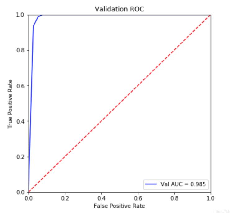
直接上代码:
from sklearn.datasets import load_breast_cancerfrom sklearn import metricsfrom sklearn.ensemble import RandomForestClassifierfrom sklearn.model_selection import train_test_splitimport pylab as pltimport warnings;warnings.filterwarnings(’ignore’)dataset = load_breast_cancer()data = dataset.datatarget = dataset.targetX_train,X_test,y_train,y_test = train_test_split(data,target,test_size=0.2)rf = RandomForestClassifier(n_estimators=5)rf.fit(X_train,y_train)pred = rf.predict_proba(X_test)[:,1]#############画图部分fpr, tpr, threshold = metrics.roc_curve(y_test, pred)roc_auc = metrics.auc(fpr, tpr)plt.figure(figsize=(6,6))plt.title(’Validation ROC’)plt.plot(fpr, tpr, ’b’, label = ’Val AUC = %0.3f’ % roc_auc)plt.legend(loc = ’lower right’)plt.plot([0, 1], [0, 1],’r--’)plt.xlim([0, 1])plt.ylim([0, 1])plt.ylabel(’True Positive Rate’)plt.xlabel(’False Positive Rate’)plt.show()
补充拓展:Python机器学习中的roc_auc曲线绘制
废话不多说,直接上代码
from sklearn.metrics import roc_curve,aucfrom sklearn.ensemble import RandomForestClassifierimport matplotlib.pyplot as pltfrom sklearn.model_selection import train_test_splitx_train,y_train,x_test,y_test=train_test_split(x,y,test_size=0.2)rf=RandomForestClassifier()rf.fit(x_train,y_train)rf.score(x_train,y_train)print(’trainscore:’+str(rfbest.score(x_train,y_train)))print(’testscore:’+str(rfbest.score(x_test,y_test)))y_score=rfbest.fit(x_train,y_train).predict_proba(x_test) #descision_function()不可用print(type(y_score))fpr,tpr,threshold=roc_curve(y_test,y_score[:, 1])roc_auc=auc(fpr,tpr)plt.figure(figsize=(10,10))plt.plot(fpr, tpr, color=’darkorange’,lw=2, label=’ROC curve (area = %0.2f)’ % roc_auc) ###假正率为横坐标,真正率为纵坐标做曲线plt.plot([0, 1], [0, 1], color=’navy’, lw=2, linestyle=’--’)plt.xlim([0.0, 1.0])plt.ylim([0.0, 1.05])plt.xlabel(’False Positive Rate’)plt.ylabel(’True Positive Rate’)plt.title(’Receiver operating characteristic example’)plt.legend(loc='lower right')plt.show()
以上这篇利用python画出AUC曲线的实例就是小编分享给大家的全部内容了,希望能给大家一个参考,也希望大家多多支持好吧啦网。
相关文章:
1. IntelliJ IDEA设置条件断点的方法步骤2. PHP输入流php://input的使用分析3. HTML DOM setInterval和clearInterval方法案例详解4. 如何在jsp界面中插入图片5. IIS Express 取代 ASP.NET Development Server的配置方法6. python3格式化字符串 f-string的高级用法(推荐)7. 利用Python实现最小二乘法与梯度下降算法8. python中逻辑与或(and、or)和按位与或异或(&、|、^)区别9. ASP.NET堆和栈二之值类型和引用类型的参数传递和内存分配10. Python变量格式化输出实现原理解析

 网公网安备
网公网安备