基于Vue.js+Nuxt开发自定义弹出层组件
今天给大家分享VPopup 基于Vue.js构建的轻量级移动端弹出框组件,详情如下所示:
一款融合了Vant、NutUI等热门Vue组件库中的Popup弹层、Dialog对话框、Toast提示框、ActionSheet动作面板框、Notify通知框等功能。
快速使用
在main.js中引入组件
// 引入弹窗Popupimport Popup from ’./components/popup’Vue.use(Popup)
支持如下两种 组件式 及 函数式 调用插件。
组件式
<template> <view id='root'> ... <!-- 弹窗模板 --> <v-popup v-model='showDialog' anim='scaleIn' content='这里显示弹出框内容!' shadeClose='false' xclose :btns='[ {...}, {...}, ]' /> </view></template>
函数式
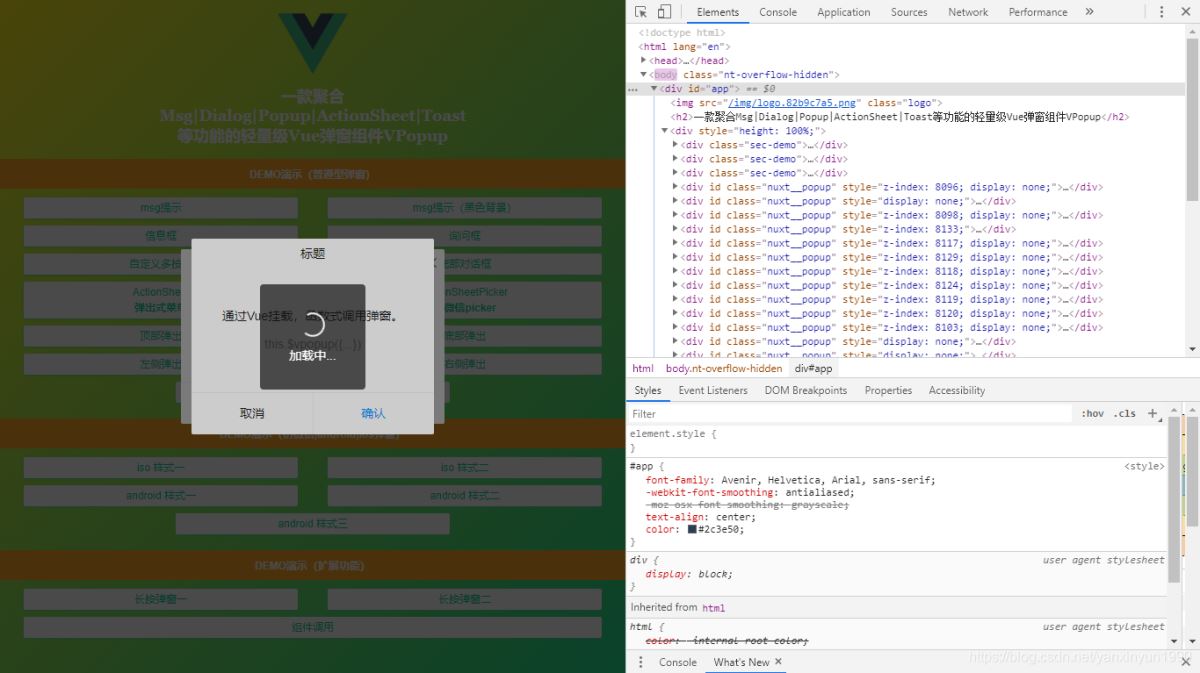
<script> export default { ... methods: { handleShowDialog() { let $el = this.$vpopup({ title: ’标题’, content: ’这里显示弹出框内容!’, anim: ’scaleIn’, shadeClose: false, xclose: true, onClose: () => { console.log(’vpopup is closed!’) }, btns: [ {text: ’关闭’}, { text: ’确定’, style: ’color:#00e0a1’, click: () => { $el.close() } } ] }); } } }</script>
在实际项目开发中,大家可根据需要自行选择调用。
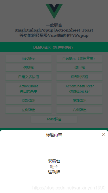
msg信息提示

<script> export default { ... methods: { handleShowDialog() { let $el = this.$vpopup({ title: ’标题’, content: ’这里显示弹出框内容!’, anim: ’scaleIn’, shadeClose: false, xclose: true, onClose: () => { console.log(’vpopup is closed!’) }, btns: [ {text: ’关闭’}, { text: ’确定’, style: ’color:#00e0a1’, click: () => { $el.close() } } ] }); } } }</script>
ActionSheet动作面板框
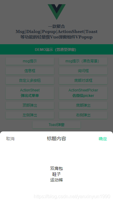
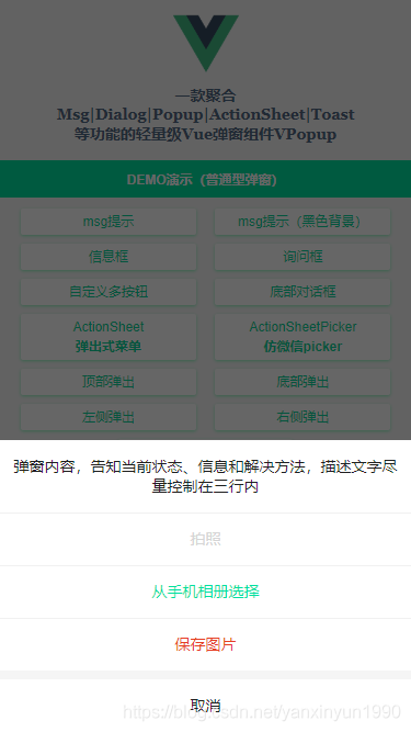

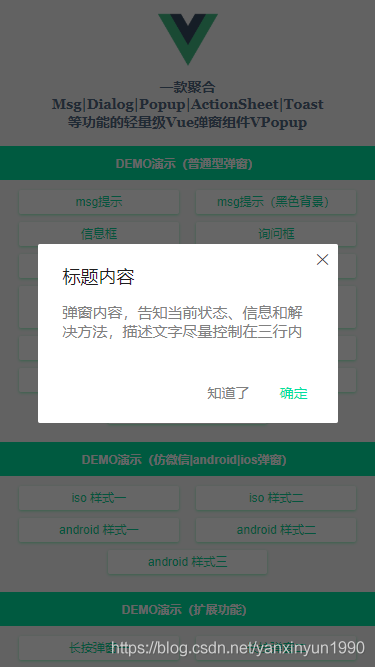
<!-- ActionSheet底部弹出式菜单 --><v-popup v-model='showActionSheet' anim='footer' type='actionsheet' :z-index='1011' content='弹窗内容,告知当前状态、信息和解决方法,描述文字尽量控制在三行内' :btns='[ {text: ’拍照’, style: ’color:#09f;’, disabled: true, click: handleInfo}, {text: ’从手机相册选择’, style: ’color:#00e0a1;’, click: handleInfo}, {text: ’保存图片’, style: ’color:#e63d23;’, click: () => null}, {text: ’取消’, click: () => showActionSheet=false}, ]'/>
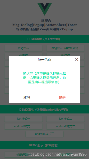
IOS风格弹窗
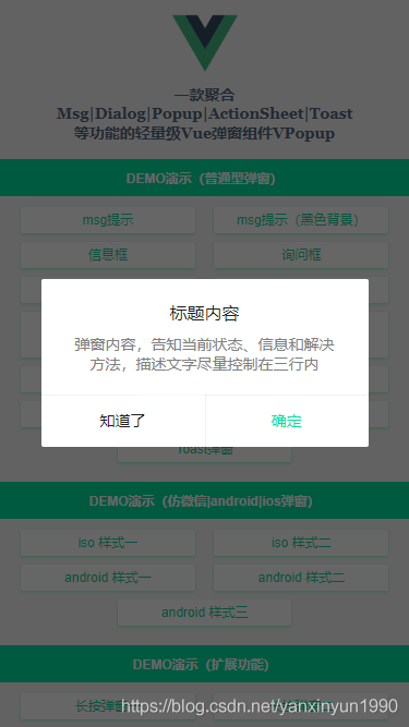
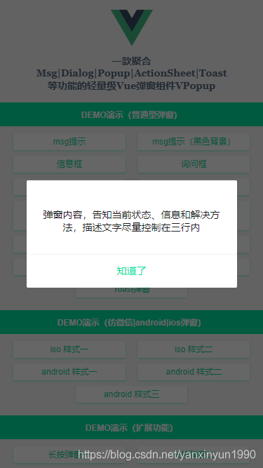
<!-- Ios风格样式 --><v-popup v-model='showIos1' type='ios' shadeClose='false' z-index='1990'content='弹窗内容,告知当前状态、信息和解决方法,描述文字尽量控制在三行内':btns='[{text: ’知道了’, click: () => showIos1=false},{text: ’确定’, style: ’color:#00e0a1;’, click: handleInfo},]'></v-popup>
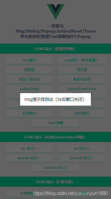
Toast加载提示框
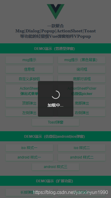
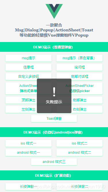
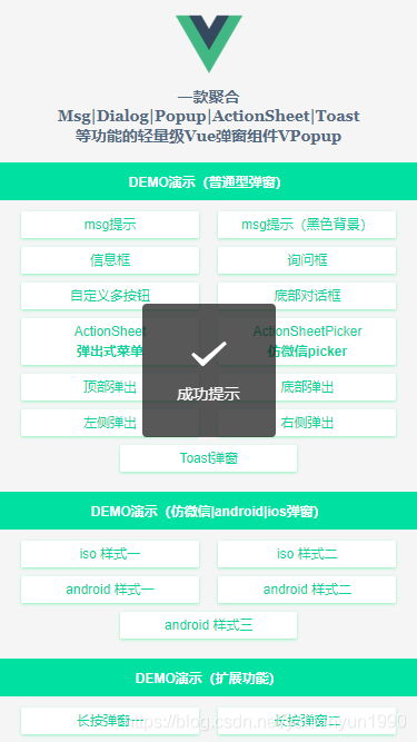
<!-- Toast弹窗 --><v-popup v-model='showToast' type='toast' icon='loading' time='5' content='加载中...' /><v-popup v-model='showToast' type='toast' icon='success' shade='false' time='3' content='成功提示' /><v-popup v-model='showToast' type='toast' icon='fail' shade='false' time='3' content='失败提示' />
emmm~~ 看了如上效果,是不是觉得还不错哟!那就继续往下看实现过程吧😀
弹窗参数配置
弹窗支持如下参数配置,大家根据需要自行组合搭配使用。
@@Props------------------------------------------v-model 当前组件是否显示title 标题content 内容(支持自定义插槽内容)type 弹窗类型(toast | footer | actionsheet | actionsheetPicker | android/ios)popupStyle 自定义弹窗样式icon toast图标(loading | success | fail)shade 是否显示遮罩层shadeClose 是否点击遮罩时关闭弹窗opacity 遮罩层透明度round 是否显示圆角xclose 是否显示关闭图标xposition 关闭图标位置(left | right | top | bottom)xcolor 关闭图标颜色anim 弹窗动画(scaleIn | fadeIn | footer | fadeInUp | fadeInDown)position 弹出位置(top | right | bottom | left)follow 长按/右键弹窗(坐标点)time 弹窗自动关闭秒数(1、2、3)zIndex 弹窗层叠(默认8080)btns 弹窗按钮(参数:text|style|disabled|click) @@$emit------------------------------------------open 打开弹出层时触发(@open='xxx')close 关闭弹出层时触发(@close='xxx') @@Event------------------------------------------onOpen 打开弹窗回调onClose 关闭弹窗回调
弹窗template模板
<template> <div v-show='opened' : :id='id'> <div v-if='JSON.parse(shade)' @click='shadeClicked' :style='{opacity}'></div> <div class='nuxt__wrap'> <div class='nuxt__wrap-section'> <div : :style='popupStyle'> <div v-if='title' v-html='title'></div> <div v-if='type==’toast’&&icon' : v-html='toastIcon[icon]'></div> <template v-if='$slots.content'><div class='nuxt__wrap-cnt'><slot name='content' /></div></template> <template v-else><div v-if='content' v-html='content'></div></template> <slot /> <div v-if='btns' class='nuxt__wrap-btns'> <span v-for='(btn,index) in btns' :key='index' : v-html='btn.text'></span> </div> <span v-if='xclose' : : @click='close'></span> </div> </div> </div> </div></template>
/** * @Desc VueJs自定义弹窗组件VPopup * @Time andy by 2020-10-06 * @About Q:282310962 wx:xy190310 */<script> let $index = 0, $lockCount = 0, $timer = {}; export default { props: { ... }, data() { return { opened: false, closeCls: ’’, toastIcon: { ... } } }, watch: { value(val) { const type = val ? ’open’ : ’close’; this[type](); }, }, methods: { // 打开弹窗 open() { if(this.opened) return; this.opened = true; this.$emit(’open’); typeof this.onOpen === ’function’ && this.onOpen(); if(JSON.parse(this.shade)) { if(!$lockCount) { document.body.classList.add(’nt-overflow-hidden’); } $lockCount++; } // 倒计时关闭 if(this.time) { $index++; if($timer[$index] !== null) clearTimeout($timer[$index]) $timer[$index] = setTimeout(() => { this.close(); }, parseInt(this.time) * 1000); } if(this.follow) { this.$nextTick(() => { let obj = this.$el.querySelector(’.nuxt__wrap-child’); let oW, oH, winW, winH, pos; oW = obj.clientWidth; oH = obj.clientHeight; winW = window.innerWidth; winH = window.innerHeight; pos = this.getPos(this.follow[0], this.follow[1], oW, oH, winW, winH); obj.style.left = pos[0] + ’px’; obj.style.top = pos[1] + ’px’; }); } }, // 关闭弹窗 close() { if(!this.opened) return; this.closeCls = true; setTimeout(() => { this.opened = false; this.closeCls = false; if(JSON.parse(this.shade)) { $lockCount--; if(!$lockCount) { document.body.classList.remove(’nt-overflow-hidden’); } } if(this.time) { $index--; } this.$emit(’input’, false); this.$emit(’close’); typeof this.onClose === ’function’ && this.onClose(); }, 200); }, shadeClicked() { if(JSON.parse(this.shadeClose)) { this.close(); } }, btnClicked(e, index) { let btn = this.btns[index]; if(!btn.disabled) { typeof btn.click === ’function’ && btn.click(e) } }, getZIndex() { for(var $idx = parseInt(this.zIndex), $el = document.getElementsByTagName(’*’), i = 0, len = $el.length; i < len; i++) $idx = Math.max($idx, $el[i].style.zIndex) return $idx; }, // 获取弹窗坐标点 getPos(x, y, ow, oh, winW, winH) { let l = (x + ow) > winW ? x - ow : x; let t = (y + oh) > winH ? y - oh : y; return [l, t]; } }, }</script>
通过监听组件传过来的v-model值调用open和close方法。
watch: {value(val) {const type = val ? ’open’ : ’close’;this[type]();},},
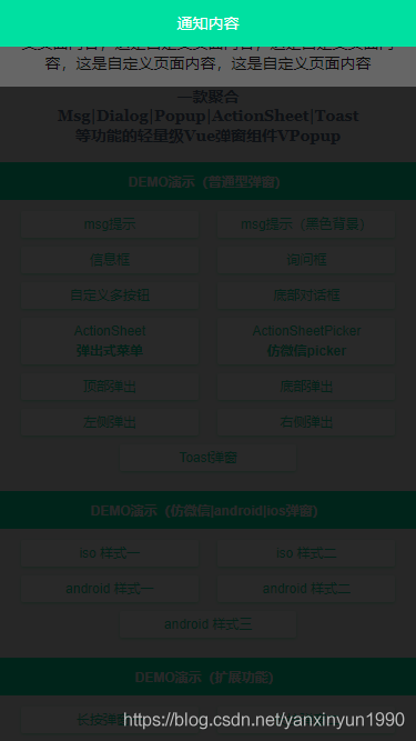
另外还支持右键弹窗/长按弹窗及自定义插槽内容。
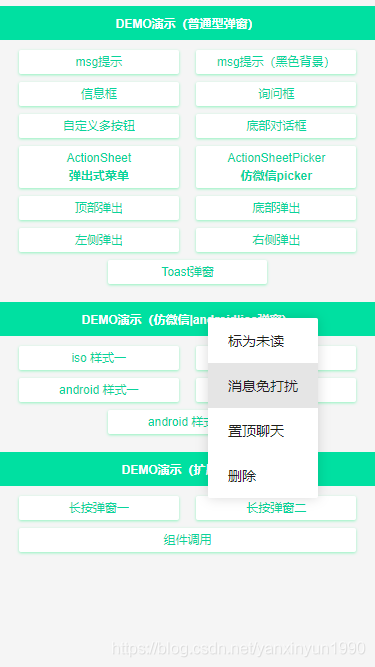
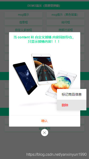
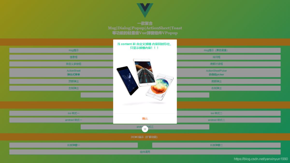
<!-- 组件调用 --><v-popup v-model='showComponent' xclose xposition='bottom' :shadeClose='false' content='这里是内容信息' :btns='[ {text: ’确认’, style: ’color:#f60;’, click: () => showComponent=false}, ]' @open='handleOpen' @close='handleClose'> <template #content><b style='color:#00e0a1;'>当 content 和 自定义插槽 内容同时存在,只显示插槽内容!!!</b></template> <!-- <div slot='content'>显示自定义插槽内容!</div> --> <div style='padding:30px 15px;'> <img src='https://img.yzcdn.cn/vant/apple-3.jpg' @click='handleContextPopup' /> </div></v-popup>
如果想通过函数式调用组件,需要用到Vue.extend扩展构造器来实现。
import Vue from ’vue’;import VuePopup from ’./popup.vue’; let PopupConstructor = Vue.extend(VuePopup); let $instance; let VPopup = function(options = {}) { // 同一个页面中,id相同的Popup的DOM只会存在一个 options.id = options.id || ’nuxt-popup-id’; $instance = new PopupConstructor({ propsData: options }); $instance.vm = $instance.$mount(); let popupDom = document.querySelector(’#’ + options.id); if(options.id && popupDom) { popupDom.parentNode.replaceChild($instance.$el, popupDom); } else { document.body.appendChild($instance.$el); } Vue.nextTick(() => { $instance.value = true; }) return $instance;} VPopup.install = () => { Vue.prototype[’$vpopup’] = VPopup; Vue.component(’v-popup’, VuePopup);} export default VPopup;
这样就实现了在Vue原型 prototype 上挂载 $vpopup 方法及注册 v-popup 组件。
设置圆角及关闭按钮
设置round、xclose即可,另外可以配置xposition来设置关闭按钮位置。
设置按钮禁用状态
设置disabled: true 可禁用按钮事件。
Okay,基于Vue.js+Nuxt开发自定义弹出层组件就介绍到这里。目前VPopup正在Nuxt新项目中使用,届时也会分享出来。
最后附上最近两个实例项目
基于vue+uniapp直播项目实现uni-app仿抖音/陌陌直播室功能
react native 仿微信聊天室实例代码
到此这篇关于基于Vue.js+Nuxt开发自定义弹出层组件的文章就介绍到这了,更多相关Vue+Nuxt自定义弹窗内容请搜索好吧啦网以前的文章或继续浏览下面的相关文章希望大家以后多多支持好吧啦网!
相关文章:
 网公网安备
网公网安备