Vue CLI3移动端适配(px2rem或postcss-plugin-px2rem)
今天,我们使用Vue CLI3 做一个移动端适配 。
前言
首先确定你的项目是Vue CLI3版本以上的。
一、移动端适配包
1、安装移动端适配包
npm i lib-flexible -S
2、在 main.js 引入适配包
import Vue from ’vue’import App from ’./App.vue’import ’lib-flexible’ // 引入适配包Vue.config.productionTip = falsenew Vue({ render: h => h(App),}).$mount(’#app’)
3、在 index.html 编辑 viewport
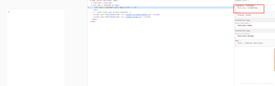
<!DOCTYPE html><html lang='en'> <head> <meta charset='utf-8'> <meta http-equiv='X-UA-Compatible' content='IE=edge'> <!-- 加上以下代码 --> <meta name='viewport' content='width=device-width, user-scalable=no, initial-scale=1.0, maximum-scale=1.0, minimum-scale=1.0'> <link rel='icon' href='https://www.haobala.com/bcjs/<%= BASE_URL %>favicon.ico' rel='external nofollow' > <title><%= htmlWebpackPlugin.options.title %></title> </head> <body> <noscript> <strong>We’re sorry but <%= htmlWebpackPlugin.options.title %> doesn’t work properly without JavaScript enabled. Please enable it to continue.</strong> </noscript> <div id='app'></div> <!-- built files will be auto injected --> </body></html>
二、CSS样式适配
1、安装 px2rem-loader 包( 只适用于css样式 )
npm i px2rem-loader -D
2、在 vue.config.js 配置
module.exports={ chainWebpack: config => { config.module .rule(’css’) .test(/.css$/) .oneOf(’vue’) .resourceQuery(/?vue/) .use(’px2rem’) .loader(’px2rem-loader’) .options({ remUnit: 75 }) },}
三、CSS预处理语言样式适配
1、安装 postcss-plugin-px2rem ( 适用于css预处理语言 )
npm i postcss-plugin-px2rem -D
2、在 vue.config.js 配置
module.exports={ css: { loaderOptions: { postcss: { plugins: [ require(’postcss-plugin-px2rem’)({ rootValue: 75, //换算基数, 默认100 ,这样的话把根标签的字体规定为1rem为50px,这样就可以从设计稿上量出多少个px直接在代码中写多上px了。 // unitPrecision: 5, //允许REM单位增长到的十进制数字。 //propWhiteList: [], //默认值是一个空数组,这意味着禁用白名单并启用所有属性。 // propBlackList: [], //黑名单 exclude: /(node_module)/, //默认false,可以(reg)利用正则表达式排除某些文件夹的方法,例如/(node_module)/如果想把前端UI框架内的px也转换成rem,请把此属性设为默认值 // selectorBlackList: [], //要忽略并保留为px的选择器 // ignoreIdentifier: false, //(boolean/string)忽略单个属性的方法,启用ignoreidentifier后,replace将自动设置为true。 // replace: true, // (布尔值)替换包含REM的规则,而不是添加回退。 mediaQuery: false, //(布尔值)允许在媒体查询中转换px。 minPixelValue: 3 //设置要替换的最小像素值(3px会被转rem)。 默认 0 }), ] } } }}
3、在 package.json 配置,加入 postcss 相关插件
{ 'name': 'app', 'version': '0.1.0', 'private': true, 'scripts': { 'serve': 'vue-cli-service serve', 'build': 'vue-cli-service build', 'lint': 'vue-cli-service lint' }, 'dependencies': { 'core-js': '^3.6.4', 'lib-flexible': '^0.3.2', 'vue': '^2.6.11' }, 'devDependencies': { '@vue/cli-plugin-babel': '~4.3.0', '@vue/cli-plugin-eslint': '~4.3.0', '@vue/cli-service': '~4.3.0', 'babel-eslint': '^10.1.0', 'eslint': '^6.7.2', 'eslint-plugin-vue': '^6.2.2', 'node-sass': '^4.14.0', 'postcss-plugin-px2rem': '^0.8.1', 'px2rem-loader': '^0.1.9', 'sass-loader': '^8.0.2', 'vue-template-compiler': '^2.6.11' }, 'postcss': { 'plugins': { 'autoprefixer': {}, 'precss': {} } }}
结语
到此这篇关于Vue CLI3移动端适配(px2rem或postcss-plugin-px2rem)的文章就介绍到这了,更多相关Vue CLI3移动端适配内容请搜索好吧啦网以前的文章或继续浏览下面的相关文章希望大家以后多多支持好吧啦网!
相关文章:
 网公网安备
网公网安备