Vue组件化开发之通用型弹出框的实现
本文主要分享关于组件化开发的理解,让刚入门的小伙伴少走一些弯路,提高开发效率,作者本人也是新手,如有不当之处,请大佬指出,感谢。
相信很多刚入门的小伙伴,经常会写很多重复的代码,而这些代码一般情况下也都是大同小异,在这种情况下,如何让开发和学习变得更加高效,组件化的思想就显得尤为重要。这里通过设计一个简单的弹出框,给小伙伴们分享组件化的应用。
组件&组件化
组件化是对某些可以进行复用的功能进行封装的标准化工作。组件一般会内含自身的内部UI元素、样式和JS逻辑代码,它可以很方便的在应用的任何地方进行快速的嵌入。组件内部可以使用其他组件来构成更复杂的组件。
在实际的开发中,我们应该避免去编写重复的代码,将精力放在更加核心的部分,因此就需要将这些重复的代码抽取出来,封装成公共的组件,提高开发效率,但同时也要注意组件的健壮性和可复用性,让它能够尽可能适应更多的场景。
基本结构
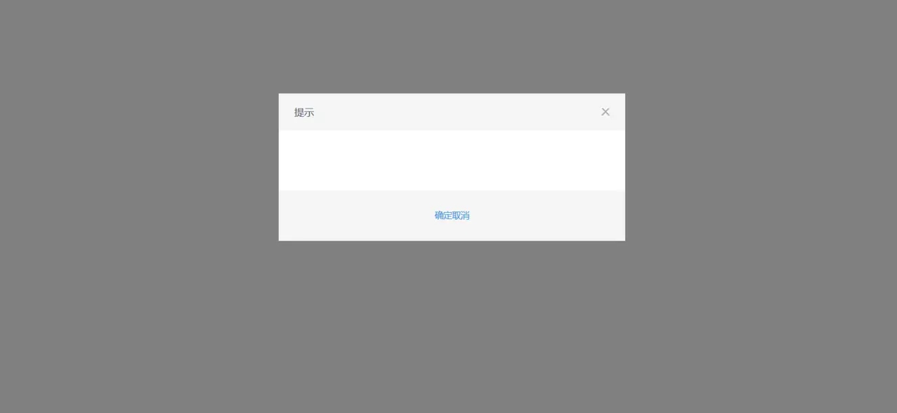
首先是弹出框的基本结构
<div class='modal'> <div class='mask'></div> <div class='modal-dialog'> <div class='modal-header'> <span>标题</span> <a href='javascript:;' rel='external nofollow' rel='external nofollow' rel='external nofollow' rel='external nofollow' rel='external nofollow' rel='external nofollow' rel='external nofollow' rel='external nofollow' class='icon-close'></a> </div> <div class='modal-body'> <slot name='body'></slot> </div> <div class='modal-footer'> <a href='javascript:;' rel='external nofollow' rel='external nofollow' rel='external nofollow' rel='external nofollow' rel='external nofollow' rel='external nofollow' rel='external nofollow' rel='external nofollow' class='btn'>确定</a> <a href='javascript:;' rel='external nofollow' rel='external nofollow' rel='external nofollow' rel='external nofollow' rel='external nofollow' rel='external nofollow' rel='external nofollow' rel='external nofollow' class='btn btn-default'>取消</a> </div> </div> </div> </div>
基本结构很简单,稍微注意一点的就是 slot 插槽,如果没有提供name属性,它将有一个隐含的名字default,并且在父组件如果没有指定 slot 的 v-slot 属性的话,内容会传给default插槽。
在这里定义了 slot 的name属性 body ,这种的叫做具名插槽,会匹配 v-slot:body 的内容。
注意,在父组件中调用需要用 <template> 包裹,并且 <template> 元素中的所有内容都将被传入相应的插槽。
给弹出框加点样式
.modal { position: fixed; top: 0; left: 0; width: 100%; height: 100%; .mask { position: fixed; top: 0; left: 0; width: 100%; height: 100%; background-color: #000000; opacity: 0.5; } .modal-dialog { position: absolute; top: 40%; left: 50%; width: 560px; height: auto; background-color: #ffffff; transform: translate(-50%, -50%); .modal-header { height: 60px; background-color: #F5F5F5; padding: 0 25px; line-height: 60px; font-size: 16px; .icon-close { position: absolute; top: 23px; right: 25px; width: 14px; height: 14px; background: url('/static/img/icon-close.png') no-repeat center; background-size: contain; } } .modal-body { padding: 42px 40px 54px; font-size: 14px; } .modal-footer { height: 82px; line-height: 82px; text-align: center; background-color: #F5F5F5; } }}
我这里使用的是 scss ,使用的时候别忘了安装 node-sass 和 sass-loader ,现在我们的页面是这个样子了
虽然还是不太美观,但是已经基本上是一个弹出框的雏形了,并且我没有给 a 标记样式,原因在后面。
SCSS函数
回过头再看看上面的 css 代码,这里重复写了4次固定定位的代码,而且随着项目的推进,肯定还有更多类似的代码,何不将这些部分抽取出来,进行封装呢? scss 提供了这个功能,将 css 封装成函数,这里的函数直接会返回函数体。我们在遇到类似的情况时,就能够直接复用。
在 assets 目录下新建 scss 文件夹并在里面新建 mixin.scss ,在里面新建 position 函数,代码如下:
@mixin position($pos: absolute, $top: 0, $left: 0, $w: 100%, $h: 100%) { position: $pos; top: $top; left: $left; width: $w; height: $h;}
接着我们引入 mixin.scss ,用 position 函数替换我们原先的代码
通过@include方式使用 scss 函数: @include position(fixed); 括号里面的是参数。
关于按钮
每一个网站都有很多按钮,不过,同一个网站的按钮风格大多都是一样,无非是大小不一。因此可以单独在 scss 文件下新建 button.scss 然后在 App.vue 里面引入这个文件,在后面除了一些特别的样式,其它就不需要给按钮定义样式了,这样也便于维护。这里给出我的 button 文件,可以参考一下。
.btn { display: inline-block; width: 110px; line-height: 30px; text-align: center; background-color: #FF6600; color: #ffffff; border: none; cursor: pointer;}.btn-default { background-color: #b0b0b0; color: #d7d7d7;}.btn-large { width: 202px; height: 50px; line-height: 50px; font-size: 18px;}.btn-huge { width: 300px; height: 54px; line-height: 54px; font-size: 16px;}.btn-group { .btn { margin-right: 20px; &:last-child { margin-right: 0; } }}
为了复用
当前这个弹出框还只是一个固定的结构,它并不能在其他地方复用,需要进行一些处理,将所有可变部分抽取出来,例如标题,按钮,内容。因为有插槽,所以内容就不用考虑,需要关注的是标题和按钮,因为标题有可能是提示,警告等等,按钮也有可能是确定、取消的一个或两个都有。而这些信息都是从父组件传递过来,需要用 props 接收。
在 props 里面添加如下代码,并给某些属性指定默认值:
props: { // 弹框标题 title: String, // 按钮类型: 1:确定按钮 2:取消按钮 3:确定取消 btnType: String, // 按钮文本 sureText: { type: String, default: '确定' }, cancleText: { type: String, default: '取消' }, showModal: Boolean }
添加完之后,还需重新改写代码
<div v-show='showModal'> <div class='mask'></div> <div class='modal-dialog'> <div class='modal-header'> <span>{{title}}</span> <a href='javascript:;' rel='external nofollow' rel='external nofollow' rel='external nofollow' rel='external nofollow' rel='external nofollow' rel='external nofollow' rel='external nofollow' rel='external nofollow' @click='$emit(’cancle’)'></a> </div> <div class='modal-body'> <slot name='body'></slot> </div> <div class='modal-footer'> <a href='javascript:;' rel='external nofollow' rel='external nofollow' rel='external nofollow' rel='external nofollow' rel='external nofollow' rel='external nofollow' rel='external nofollow' rel='external nofollow' v-if='btnType==1'@click='$emit(’submit’)'{{sureText}}</a> <a href='javascript:;' rel='external nofollow' rel='external nofollow' rel='external nofollow' rel='external nofollow' rel='external nofollow' rel='external nofollow' rel='external nofollow' rel='external nofollow' v-if='btnType==2'@click='$emit(’cancle’)'>{{cancleText}}</a> <div v-if='btnType==3'> <a href='javascript:;' rel='external nofollow' rel='external nofollow' rel='external nofollow' rel='external nofollow' rel='external nofollow' rel='external nofollow' rel='external nofollow' rel='external nofollow' @click='$emit(’submit’)'>{{sureText}}</a> <a href='javascript:;' rel='external nofollow' rel='external nofollow' rel='external nofollow' rel='external nofollow' rel='external nofollow' rel='external nofollow' rel='external nofollow' rel='external nofollow' @click='$emit(’submit’)'>{{cancleText}}</a> </div> </div> </div> </div>
通过父组件传递的参数,来实现代码的重用,并且使用 $emit 来向外抛出自定义事件,然后在父组件实现自己的业务逻辑。
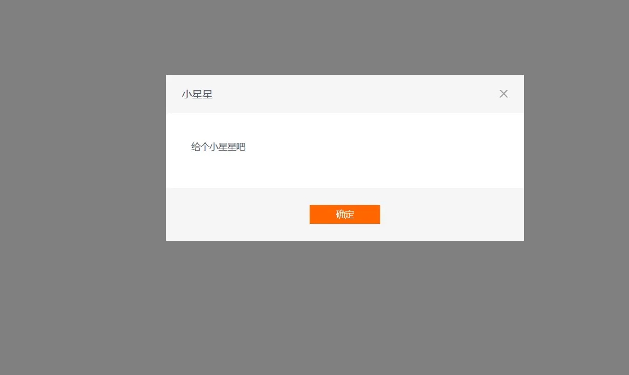
在 Home.vue 里面引入这个组件并调用
<modal sureText='确定' btnType='1' :showModal='showModal' @submit='go' @cancle='showModal=false' > <template v-slot:body> <p>给个小星星吧</p> </template> </modal>
这里的 @submit 和 @cancle 就是我们在组件里面自定义的事件
最终效果如下
实现完之后,感觉有点弹出时生硬,没关系,我们给它加点动画,在css3中有 transform 和 transition 可以实现动画效果,但是我们这里使用 vue 内置组件 <transition> ,让弹出框有一个从上面弹出的效果。
transition组件
transition 组件可以为元素或组件添加过渡效果,只会把过渡效果应用到其包裹的内容上,而不会额外渲染 DOM 元素,也不会出现在可被检查的组件层级中。它可以通过多种方式进行过渡,在这里应用 class的方式过渡。
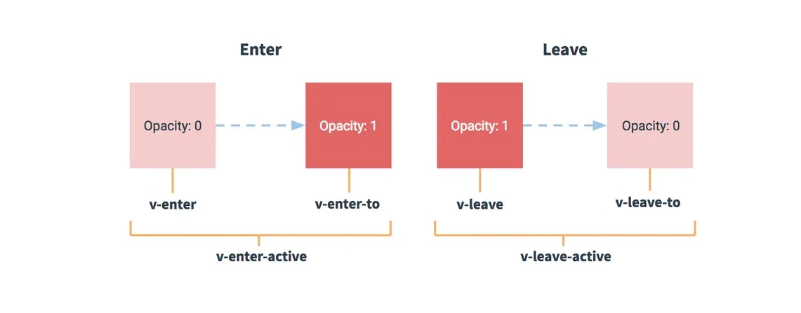
这幅图是 Vue 官方给出的图,简单来说,v-enter是动画开始的状态,v-enter-active进入过渡生效时的状态,v-enter-to是过渡的结束状态,leave同理,具体细节大家可以去 https://cn.vuejs.org/v2/guide/transitions.html查看。
当没有指定的name属性时,过渡的类名会默认以v作为前缀,这里给transition指定name为
slide并用它包裹modal组件
<transition name='slide'> <div v-show='showModal'> ... ... </div> </transition>
在style代码里面modal后面加上
&.slide-enter-active { top: 0; } &.slide-leave-active { top: -100%; } &.slide-enter { top: -100%; }
并且给modal指定需要过渡的属性
transition: top 0.5s;
加完这个之后,弹出框就会有一个滑上滑下的动画啦。
到此,我们的弹出框就完成啦。
你也可以根据自己的需求去做适当的调整,开发出适合自己项目的弹出框。
最后
在实际开发中,组件化是尤为重要的,它能够帮助我们写出更高质量的代码,也能够让我们的代码更易于维护,尽早的树立组件化的思想,对写代码也是非常有帮助的。
附上https://github.com/anpeier/shop-online
到此这篇关于Vue组件化开发之通用型弹出框的实现的文章就介绍到这了,更多相关Vue 弹出框内容请搜索好吧啦网以前的文章或继续浏览下面的相关文章希望大家以后多多支持好吧啦网!
相关文章:
 网公网安备
网公网安备